Today I'm beginning the massive share of a selection of projects I created to submit to Richard Garay's Designer Showcase. I was excited when he announced the call and started working on some special projects immediately. I compiled all my projects into a gallery on my team FB page (JOIN TEAM ITCHIN INKERS TODAY!) so that I could get the input of my fellow team members who would then vote on the ones I should submit. It was important to me to get their input and was my first stage in my project submission process.
Today I'm sharing the projects that "Didn't Make The Cut" by my team. Although I LOVE all of the projects I proposed for this call, I could only submit two cards and one scrapbooking design, so I am so grateful to my team for helping me make the final decisions! As with all of my project shares on my blog, I will share ONE PROJECT PER POST as they will include my creative process and additional photos.
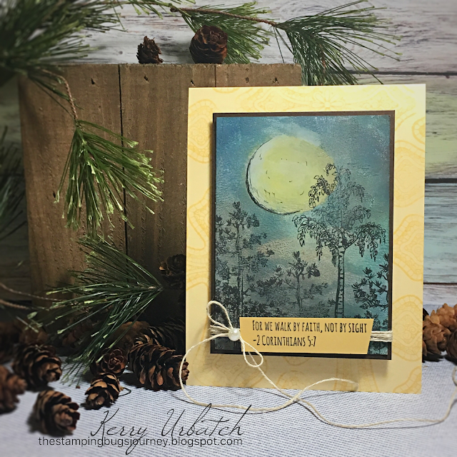
Decisions, Decisions..This card did not make the cut but I wish it did. I love it...It was my contribution for a "Masculine Feel".
To create this card, I started out by building a night sky background using my GelPress. I used a combination of Butter Cream, Pineapple Smoothie, Cool Pool Acrylic Paint, Blue Lagoon Color Splash and River Stone Liquid Color to achieve the desired brayered background layers. Once the background was complete, I added additional highlighting and color using my GelPress as a painter's palette. Spritzing the inks with a water filled Media Mister allowed me to maintain a fluid consistency throughout my painting process.
Although the moon isn't a perfect circle (I did begin by using the circle die as a stencil), I think the highlighting and the Micron ink sketch lines helped with the illusion of a beautiful glowing moon. I stamped the trees from Nature Grown Stamp Set onto the background panel to create depth and a beautiful night scene. Before mounting this to the black panel, I rubbed a bit of Huckleberry Fusion Pan Pastel (From the Rich Sorbet Collection) on the edges to finish it off. After the trees were stamped with Black Licorice ink I mounted this panel onto Black Licorice Cardstock. My next step was to search for the perfect sentiment to go with this card. I found it in the Color Cross stamp set. Just adding that sentiment over a few spins of Natural Journey Thread made the card complete...BUT...I wasn't done yet. I needed to mount this panel onto a card base so that it would shine! I pulled a Pineapple Smoothie card base and stamped the cross using Pineapple Smoothie ink to give the background some depth and pattern and helped feature the focal panel.
A little Pearl on the bow dressed this masculine card up just a bit.
Here you can see the texture achieved from the GelPress. You can also see the sketchy lines I created using a micron pen...trying to mimic the sketchy features in the stamped images.
This has to be one of my most favorite cards created yet. I love how it turned out and I know how difficult it was not to choose this one to share in the Designers call.
All of the items used in this creation can be purchased in my shop. Just simply click on the items listed in my description and you'll be directed to the product in my shop!


No comments:
Post a Comment
Thank you for taking the time to comment about my creations! I appreciate the feedback and LOVE. A stamp in the hand is a song in the heart. Kerry